
A Whole New Way for Fans to See
I spent the last several days at a Cornell/Microsoft Research Symposium about online community. Many of the people who presented are doing fascinating research on *massive* scales (scales like: ALL the metadata from YahooGroups, or Usenet, or Everquest…). and finding all kinds of patterns that characterize and predict behavior in online groups. There were several talks about network patterns in wikipedia.
I enjoyed and learned a lot from all the presentations, but the one that really caught my fancy was Fernanda Viégas’s presentation of the site Many Eyes. Fernanda is part of a visualization design research team at IBM. This site allows anyone to input their own data in a simple columns and rows spreadsheet format (they suggest some data sources if you want to play with data but don’t have your own), and then generate all kinds of amazingly rich interactive (java-based) visualizations from it at the press of the button. You can also upload free text and get an instant tag cloud. Other people can then see, comment on, and blog about the visualization.
 One of her key points is that visual representations can give us an immediate understanding (picture’s worth 1000 words and all that — and this site shows us that a multi-layered interactive picture is worth 1,000,000). Not surprisingly, among the first fans who seem to be appropriating it are sports stats people. For instance, “sportsbetting” has recently uploaded a data base from sportsinteractive.com of basketball player’s points–per-game for the 2006-2007 NBA Season. It’s a bar chart and as you scroll over each line it shows you who that line represents and his individual ppg.
Harry Potter also showed up early, when the Top Fifty Most Popular Books on LibraryThing data clearly showed Harry’s popularity with great big circles:
The coolest part, from my perspective and apparently Fernanda’s as well, was that people immediately jumped on it and personalized it by interacting with the chart to highlight the books they had read, taking a screen shot, and then posting it in the comments:
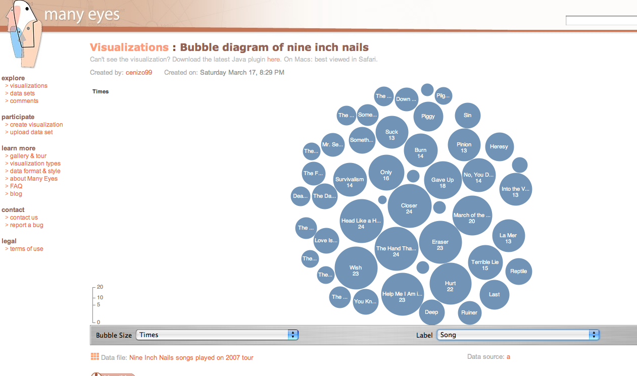
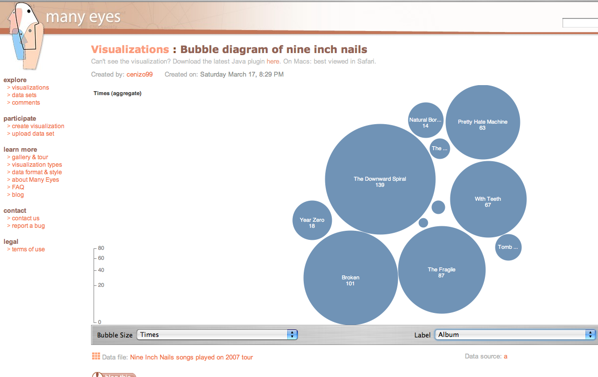
My thoughts went immediately to thinking how cool it would be to have band’s career concert chronologies up there so fans could do the same with the shows they’d been to. Suppose for example that one could see a tag cloud of all the songs Bob Dylan performed live (see here for previous blog on this), sized by how often the song was played. Suppose you could browse R.E.M. tours by town. Suppose you could do line graphs of the rise and fall of individual songs across Madrugada’s performing history.
I can’t think of a fandom that wouldn’t be able to find some really interesting and fun applications of this technology. For some (sports fans) it’ll be easier than others since so much of that information is already in statistical form. But if there’s one thing that’s true of fandom, it’s that there’s usually someone up to most tasks, so here’s a call to all the people maintaining, contributing to, and using those fan archives — think about how you could get your info uploaded here!
If you’re so bored that you think looking at conference pictures might be fun, you can find Marc “co-sponsor” Smith’s photostream on Flickr.
More interesting might be the tag chart of the symposium abstracts that Fernanda did (within about 5 minutes of my saying “wouldn’t it be cool to…”).
Stewart McKie wrote:
Many Eyes is a great site. My site at http://www.scriptcloud focuses on one thing (currently) visualizing screenplays as content clouds. Your point about song lyrics is well-taken. It would be relatively easy to create a cloud that is a fingerprint of say, Bob Dylan, by uploading most/all of his lyrics to produce one big metacloud.
Posted on 03-Apr-07 at 2:38 am | Permalink